September 9, 2016
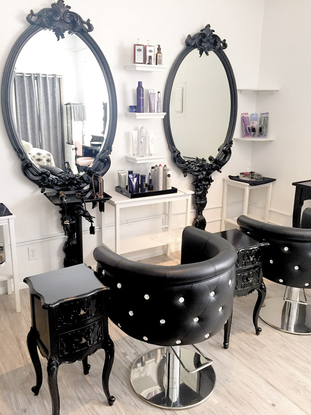
I know I’ve been talking a lot about commercial spaces — and I promise next time I’ll get back to home ideas — but this week I want to give you one more glimpse of how well-branded design can add…
August 28, 2016
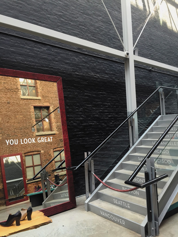
If one of these photos looks familiar, you’re right — it’s from my last column about the funky-cool John Fluevog shoe store in Vancouver. I’m using it here today because seen at a glance, the whole space indirectly conveys a…
August 14, 2016
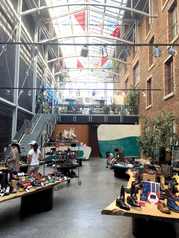
I was on a family trip to Vancouver recently, strolling through the historic Gastown district, when I came across a fascinating shoe store. Unlike the other trendy shops in the neighborhood, John Fluevog was literally created out of an alleyway.…
July 31, 2016
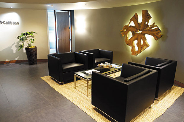
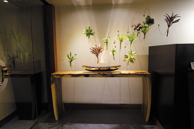
Remember the “living wall” I showed you last time from the Yamamoto Caliboso law firm’s reception area? One of the firm’s areas of expertise is energy and natural resources, so to brand the space for every client and potential client…
July 17, 2016
Most people don’t think a law office really needs branding. But I sure do! You see, in obvious or subliminal ways, ever y space reflects a message, whether it’s your entryway, bedroom or even powder room. And in the case…
July 3, 2016
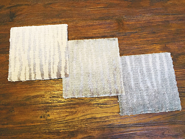
Design is all about details — even when the details are so subtle you might not notice them at first. But when you do, things fall into place and you go, “aha!” I was reorganizing a storage closet where I…
June 26, 2016
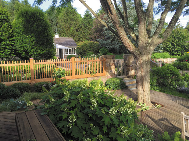
We just got back from the East Coast, where we had the treat of staying with friends on their exquisitely manicured 12-acre property in Pennsylvania. The experience was a perfect example of how the perspective of travel can make you…
June 5, 2016
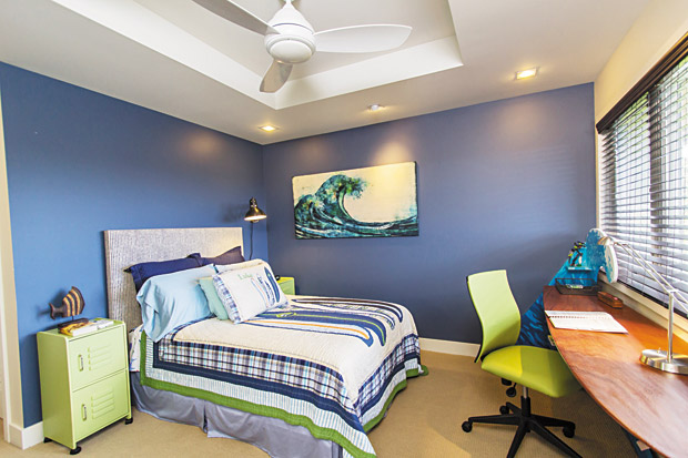
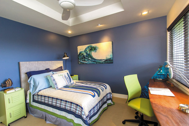
In my last column I promised you a closer look at the focal point in 11-year-old Luke’s bedroom: a totally cool surfboard desk. But before we ride that wave, I need to share with you the goal of the room.…
May 22, 2016
In my last column, I shared with you strategies on using pattern to decorate a teenage girl’s bedroom. Today it’s her younger brother’s turn and this time, I’m sharing tips on color and theme. This was a typical bedroom with…
April 24, 2016
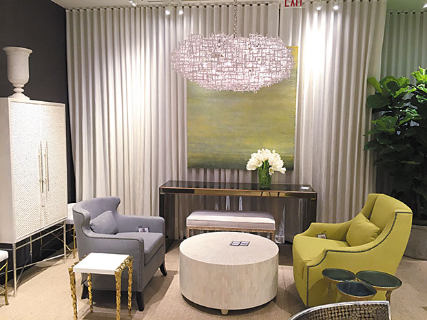
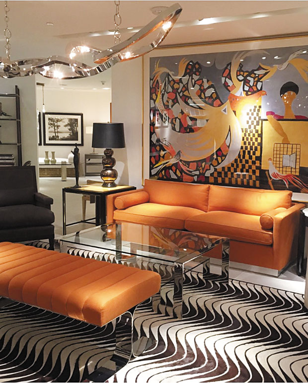
In wrapping up my columns from my visit to the Pacific Coast Design Center, I had to show you these three photos. They’re all very different vignettes from one showroom, but they perfectly illustrate an easy tip in decorating. Question:…
April 10, 2016
Recently I attended Spring Market at the Pacific Design Center in West Hollywood. Amid two days of receptions, presentations and new line introductions was a fun panel called “Generation Now: Designing for Young Affluents.” It was moderated by Sophie Donelson,…
March 29, 2016
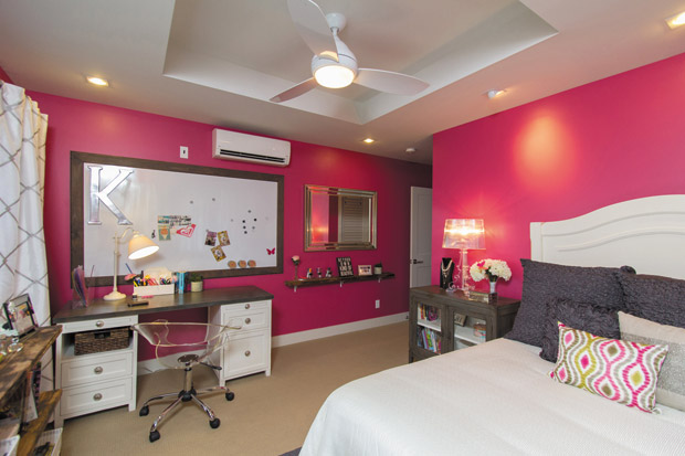
In my last column, I showed how a strategic use of pattern helped balance the bold design statements in this teenager’s bedroom. Today, I’ll finish this two-part series with two tips. 1. Mix in unexpected materials for fun and interesting…
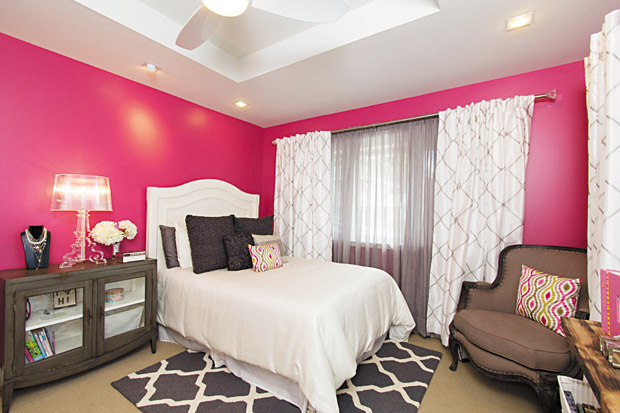
March 15, 2016
We use strategy when it comes to business or playing games, sometimes even in relationships. Well, thinking strategically is just as important when it comes to design. Let’s look at how you incorporate patterns. In conceptualizing your space, you need…
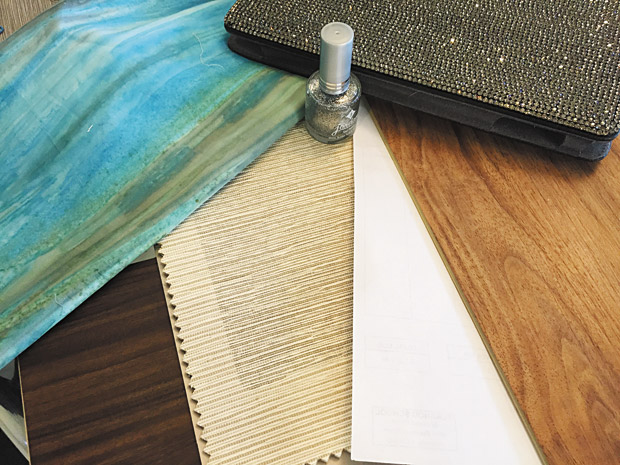
March 1, 2016
We’ve all seen them: arrangements of fabric swatches, furniture photos, tile and wood samples and strategically placed paint swatches. Designers use storyboards to see how colors and textures will work together in a space. They’re essential for us to illustrate…
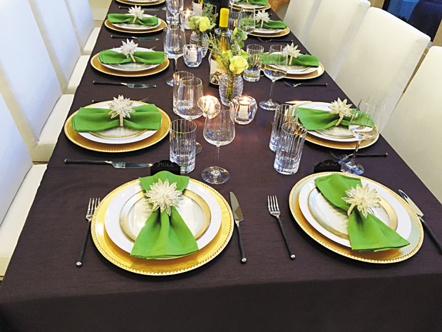
February 16, 2016
Over the years I’ve given lots of tips about decorating your table for the holidays. Today I want to share tabletop challenges and solutions for other special occasions. Last month I threw a wine-pairing birthday dinner for my husband Darrell…
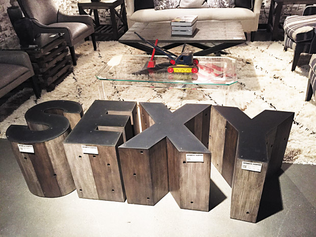
February 2, 2016
Right now I’m shopping for inspiration on one of my semi-annual Las Vegas Market buying trips. One trend I see that’s still going strong and always puts a smile on my face is rooms that literally say something. A room…

January 19, 2016
The new year is about resolutions and hopefully some new inspiration — and as I love to point out, sometimes the most surprising ones come from travels. My family spent the holidays in Japan, where I’m sure many of you…

December 20, 2015
Two years ago I gave you tips for your Christmas card photo — something that happens to be a passion of mine. Here, finally, is part two! This one’s not so much about how to stage your shot as about…
December 8, 2015
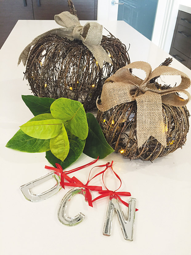
I’m a big fan of mixing luxury looks and bargain buys. I also love mixing materials — like fresh and artificial, for instance. This column is about how to do both while transitioning your Thanksgiving décor for the Christmas holidays.…
November 22, 2015
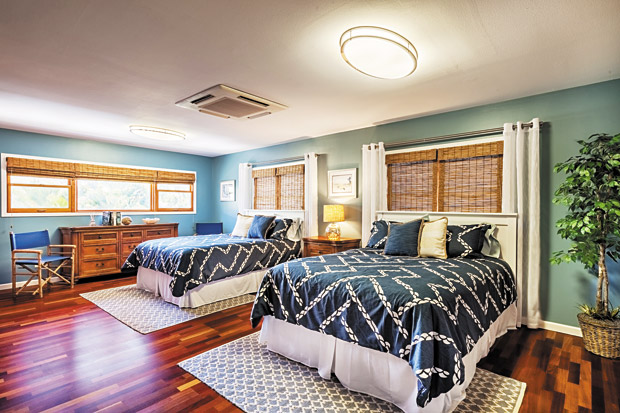
I come across design challenges all the time, but few have left me scratching my head as much as this one. Here you see a guest bedroom in my clients’ vacation rental. It’s also their two boys’ bedroom when the…
