Consider colors, moods
Do you ever wonder why you feel immediately relaxed when you enter a spa, yet when you enter a gym, you feel alert and energized? The answer can be found in the colors selected to decorate the space.
“Interior designers use color psychology to evoke an emotional response,” said director of color marketing for Sherwin-Williams Sue Wadden.
Color psychology starts by exploring warm and cool hues and then using these different tones to manipulate mood throughout your home. It’s easy to do with the tips below.
Warm color families
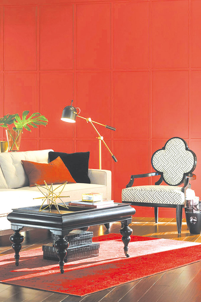
Red, orange and yellow are considered warm colors since they are associated with images of heat, like fire or sunshine. Warm families of color are bold and powerful when incorporated into home design.
Yellows
Because yellow reflects light, it’s an excellent choice for foyers and dark hallways. Its cheery nature has the ability to create an uplifting mood in homes. Rich yellows are great accent colors because they catch the eye. A great color to consider is Wadden’s favorite: Butterscotch SW 6377.
Reds
Reds evoke feelings of passion, energy and intimacy, so it’s an excellent color for workout rooms and master bedrooms. Red also inspires the appetite, so is a logical choice for dining rooms or kitchens.
Oranges
Orange has a friendly attitude that awakens and welcomes. Never understated, orange works well in family rooms and is a playful choice for children’s bedrooms or bonus rooms. Orange tones can also integrate into other colors, such as Coral Reef SW6606.
Cool color families
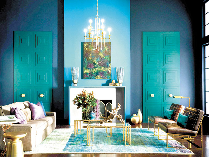
Blue, green and violet are considered cool colors because the inherent tones of each shade. Reminiscent of water and the outdoors, cool colors stimulate feelings of peace and tranquility, and are great options for bedrooms, bathrooms and patio spaces.
Blues
Blue is soothing and elicits feelings of relaxation, which is perfect for bedrooms and bathrooms.
Alternatively, blues should be kept out of the kitchen because it’s a color that’s associated with appetite suppression.
“I love cool greenish blues,” said Michael Plank, director of color marketing and design for Sherwin-Williams. “Blue Sky 0063 is from our historic palette and is a calming hue that works in virtually every room.”
Greens
Green tones provide a feeling of familiarity because they are found throughout nature. Light greens are ideal for living rooms and offices; dark greens are wonderfully rich as accent colors.
Vivid greens add unexpected pop, notes Sherwin-Williams Senior designer Karrie Hodge, who likes Marea Baja SW 9185.
“I really like dark colors and this color reminds me of the deep turquoise part of the ocean,” she said. “This would make a great front door color on a white or gray colored house.”
Violets
Purple tones are immediately attractive to children, making them a great paint option in playrooms or bonus rooms. Additionally, violet is also a stunning accent color in bathrooms.
When it comes to the violet family of colors, Hodge likes the versatility of Veri Berri SW 9069.
“Its a rich berry tone that is playful,” she said. “This would make a really dramatic accent wall color in any room; I could even see this as a really fresh front door color.”
For more color inspiration and to learn more about warm and cool colors, visit sherwin-williams.com.