Color Your World
When designing a space, choose dominant, secondary and accent colors to enliven the environment and create a cohesive look
Do you remember the beach house project that I shared with you the other week? My goal was to create a comfortable, stylish setting for a wonderful local family. I talked about turning negatives into positives — in this case, turning an empty space into a focal point with large letters that spelled out “ohana.”
Another key element of design is your color palette, and that’s what I want to talk about today. Color palettes are easy if you do them in threes. Select a dominant color, a secondary color and an accent color to make the space come alive. In small spaces especially, too many colors will make things feel chopped up, so three is the magic number.
As I do with every client, I asked what colors they like and don’t like. I found out the wife likes whites and yellows. My job is to take that in to account and create a color palette that will complement the space.
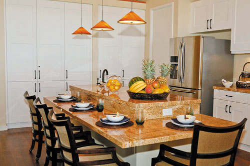
The flooring we chose from The Floor Store was a dark vinyl planking that withstands water, sand and salt. We decided on white for the cabinets to lift the space. And since the house is on the ocean, I wanted the rest of the colors to go in a beachy direction. I chose blues for the accent wall on one side of the house and gold, the color of sunsets and sand, for the opposite wall.
So I had my palette of blues, whites and golds. Now how do you take a color scheme and make it work?
Photos: Justin Dotson
The trick is to switch out your dominant colors. This house was sunny and airy but cozy, so I decided that on the side where blues dominated, yellows and whites would be secondary, and where whites dominated, yellows and blues would be secondary.
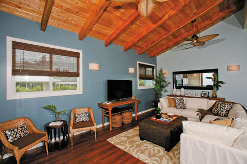
In this photo of the family room, you can’t see the white kitchen cabinets, but they are only a few feet away. I needed to pick up some of that brightness, but not too much. So the sectional sofa is white but sprinkled with the same accent-wall blue.
Notice the golden hues of the throw pillows. That gold is also in the beautiful, rich granite we found at Marmol as well as in the commercial fabric we used to upholster the counter chairs.
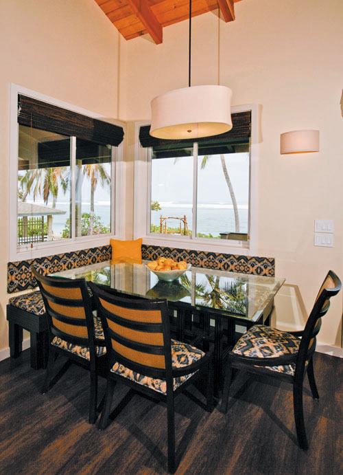
In the white kitchen, the place settings pick up touches of blue. The dining area has a blue ikat banquette that we designed as functional seating, and a pop of fresh yellow in the pillows and the centerpiece.
The color palette remains the same, allowing the spaces to feel bigger and cohesive, yet interesting because they have different dominant colors. I did introduce other colors in other rooms, but made sure to incorporate golds and whites everywhere.
As you decorate your own home or office and transition from one space to another, keep this idea in mind. Even if you use the same colors, how can you vary their proportions? This doesn’t mean you can’t introduce other colors, but especially with smaller spaces, sticking within your color palette will make it breathe better.
So go ahead and color your space — after all, it’s as easy as 1-2-3!
Cathy Lee is president and designer of Cathy Lee Style and Cathy’s Marketplace. She recently opened reStyle Hawaii, an affordable, style-conscious consignment warehouse with upholstering and repurposing services. To find out more, go to www.cathyleestyle.com.