The Rule of Three
When searching for colors, textures and spacial divisions to complete your look, stick to the “design in threes” principle for a perfectly balanced space
Happy New Year! I know you’ve just barely gotten over Christmas and are probably still recuperating from those charge card bills, but nothing says it’s a new year like a new space! Haha! Well, that’s the designer in me talking, anyway.
So if you’ve cleared out the Christmas tree and trimmings and are ready for a fresh start in your space, I’ve got some easy tips for you.
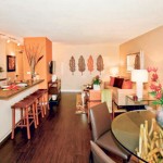
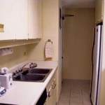
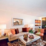
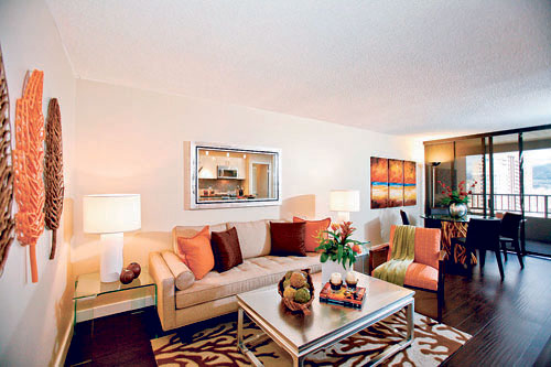
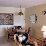
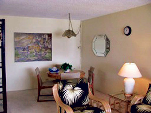
A few months ago I completely remodeled a unit in Discovery Bay. The unit is a vacation rental that belongs to Paul Knight, a client from Canada. As you can see from the before photos, the decor was completely outdated. Paul wanted an overhaul and gave me free rein to create a space that was unique and different, but still had an island feel.
Whether you’re thinking of a remodel or simply a fluff-up, an easy rule to remember is to design in threes. It’s especially useful, since many people tend to decorate with too much of one thing, like wood everywhere, or beige everywhere.
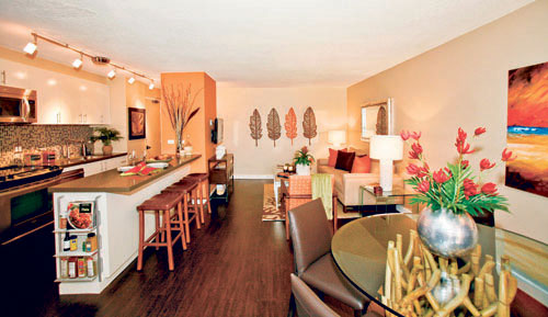
Let’s start with color. I like to have a primary, secondary and accent color. Knowing I wanted a rich, dark floor, I went with a fresh primary color and kept the walls a light cream and the kitchen cabinets white.
-
- After
-
- Before
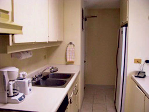
-
- After
-
- Before
Other touches carry the white throughout the space, like the ceramic lamps, ceramic elephant and vase.
My secondary color was rich brown: dark floors setting off the light walls, two shades of brown in the area rug, brown accent pillows and dining chairs.
Finally, the accents. I love orange because it pops with creative energy. Orange is the color on the accent wall and in the armchair, throw pillows and even the one pop in the banana-leaf art.
Next is threes in texture. The dominant texture is natural wood. Can you spot the wood elements in the space? How about elements of my second texture, metals? Don’t overlook the rail lighting — and the appliances in the kitchen pick up the sheen.
My third textural element is glass. The side tables, dining table, light cups in the rail lighting and glass accents on the counter-tops all carry this theme. And I wish you could see how the glass tiles in the kitchen backsplash take up the whites and browns and make them sparkle, but unfortunately the under-counter lighting wasn’t working the day of the photo shoot.
Finally, threes work for spatial divisions, too. A balanced, visually pleasing space needs high, medium and low elements. Try to have objects line up at different levels. Notice that the tops of the banana leaves line up with the top of the mirror? Other elements are the same height as the chairs and so on. Break it up so not everything is on one level, and then bring in a sense of order by creating horizontal lines for the eye to follow.
See? Whether you’re planning a remodel or just a fluff-up of your space in 2013, it can be as easy as 1-2-3!
Cathy Lee is president and designer of Cathy Lee Style and Cathy’s Marketplace, a furniture and accessories showroom with design services at 1110 University Ave. She recently opened reStyle Hawaii, an affordable, style-conscious consignment warehouse with upholstering and repurposing services at 420 Keawe St. To find out more, go to www.cathyleestyle.com.