Bathrooms may be small spaces, but they are big headaches to design. So many trades. So many details. And so much dust!
I was reminded of this during a recent bathroom renovation for my clients, Kim and Rob. The couple had one tiny, unsightly bathroom in their home that was so dysfunctional it was wreaking havoc on their marriage. There just wasn’t enough room for two.
They wanted a sleek, up-to-date bathroom to match the rest of their modern house and had an unused room beside the bathroom. So I decided to take the two drab, dated rooms and give Kim and Rob a gorgeous bathroom that was both functional and luxurious.
But I couldn’t do it alone. A full-on bathroom gut like this calls for a team of specialists, and everything depends on one person finishing one part of the project before the next person can begin.
So, after assembling my dream team, I left it to knock down the wall between the two rooms, configure the new plumbing lines, reinforce the joists, drop the ceiling to accommodate recessed lighting and replace all of the windows. Did I mention that there also was a 500-pound claw-foot tub to remove?
Happy to flee all of the construction, I ducked out for some fresh air. I think a modern bathroom should feel like a soothing spa, so I took a trip to a newly opened spa hotel for some inspiration.
The spa has a great lounge that is contemporary, but oozes warmth and relaxation. And details like textured walls and unexpected large-scale patterns really make it come alive. I knew I wanted the same feeling for Kim and Rob’s bathroom.
Figuring that the dust had settled, I headed back to Kim and Rob’s to find one big, beautiful, empty room. It was then time to organize things and concentrate on the details.
I painted the room a very soft grayish white and put down cool white floor tiles with a slight wood-grain texture. Tiling a bathroom is like using fabric in other rooms – it’s what really gels the style and character.
Typically when I open the door to a bathroom, I want to see something beautiful. So what you won’t see when you first walk into Kim and Rob’s bathroom is the toilet. That’s because I hid it beside the bathroom door. What you will see is a stunning wall with two floating vanities in dark wood. These now flank the window under which I placed a tailored wooden bench upholstered in a large-scale fuchsia-and-white patterned damask.
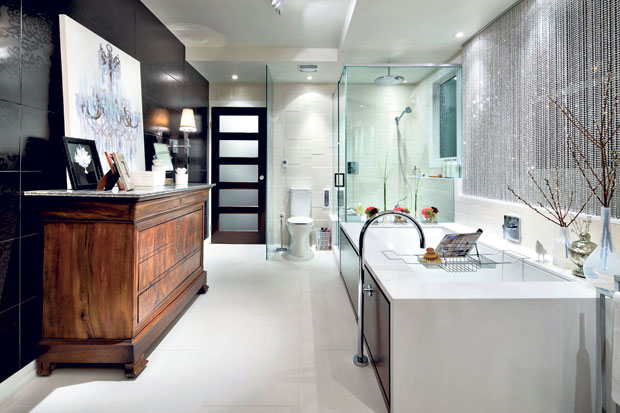
To one side of the vanity wall I set a sparkling white, clean lined tub and shower that blend beautifully into a wall of white, stacked-pattern tiling. The glassed-in shower includes a huge rain showerhead and a luxurious bench. Next to the shower is the deep soaker tub with integrated lumbar support and a floor-mounted tub filler.
Above the bathtub I decided to go with an especially interesting treatment for the windows. Inspired by a visit to my local hardware store, I got rolls and rolls of large-sized, faceted bathtub chain and fashioned it into a striking curtain that provides both privacy and sparkle.
On the other side of the room I used glamorous black, dahlia-patterned tiles to create a dazzling feature wall. Against this wall I placed a classic, wooden antique chest of drawers that brings contrast and warmth to the room. I then flanked it with a pair of stunning sconces.
After adding a few more accessories, including beautiful artwork and an ornate chandelier, the bathroom was complete. Now Kim and Rob have a modern, spa-like bathroom that has more than enough room for two. Just doing my small part for marital bliss.
Interior decorator Candice Olson is host of HGTV’s “Divine Design.”
