If you’re planning to tackle a home decorating project this year, here are the top trends you should consider:
Acrylic everything
Acrylic was a trend that picked up steam in 2016 and will keep going strong this year. Because most acrylic is clear, it works with almost any type of design style or color scheme. Acrylic furniture pieces and accessories have been around for years, but they primarily came in very modern shapes that wouldn’t work well in a more traditional home. All of that has changed, and now you can find the best of both worlds with this more modern material being used in furniture with traditional designs. Bring acrylic into your space by choosing a larger piece, such as a coffee table from Wisteria, or simply use smaller accessories, such as an acrylic floating frame. Whether it’s a coffee table or fl oating frame, acrylic accents and accessories are this year’s clear favorite for adding a gleaming finish to a space.
Marble wallpaper
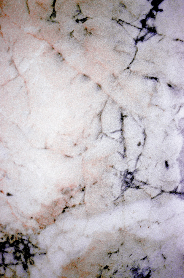
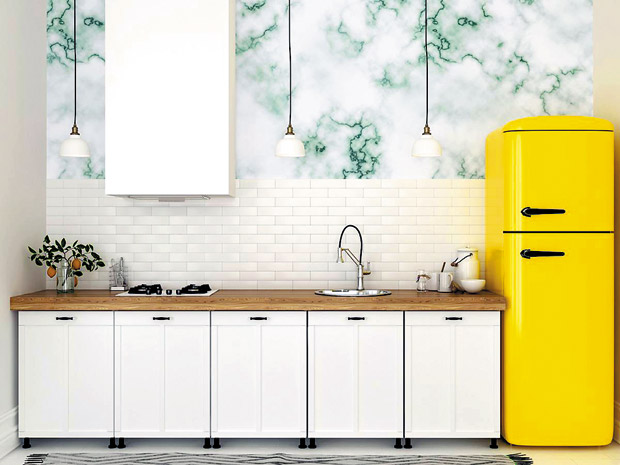
A lot of the 2017 trends are about going back to classic styles, and it doesn’t get much more classic than marble. Few materials evoke high-end living as simply and effectively as marble, a global symbol of refined taste and sophistication. Marble was a big trend in 2016, and it looks like it’s here to stay. With faux-effect materials and faux-marble wallpapers such as this beauty from Murals Your Way growing in popularity, you can count on the soft, subdued design to be a top pick for accent walls, powder rooms, kitchens and more. It’s a seriously impressive way to dress up your walls.
Deep blues
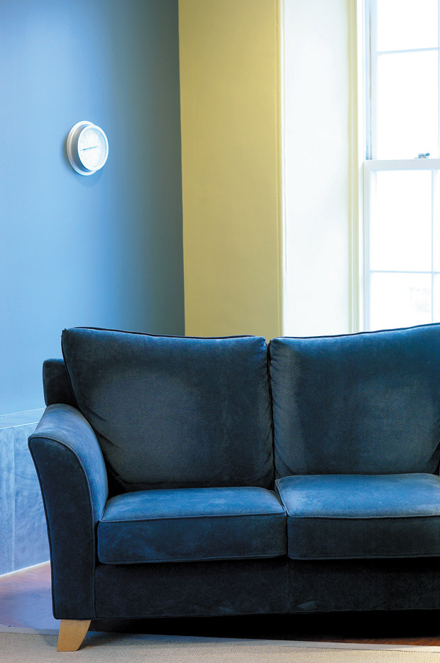
Though black has long been a decorating darling, designers are now recruiting deep blues for their go-to power hue. It’s a bit more approachable than pure black, and it has a lovely nautical vibe when used in conjunction with materials like rope, brass and wood. Navy velvet couches are a popular way to incorporate the color into your home. And if you want to keep your space light, wallpaper with blue accents is a great solution. Whether you go for indigo, cobalt, navy or some other blue hue, a dramatic, deep blue color will add interest to your space.
Farmhouse chic
Reclaimed wood, aged metals and distressed details are showing up everywhere in interior design and are not going anywhere in 2017. Farmhouse chic decor is a spin on the classic farmhouse style with an added soft elegance. Classic shapes, rustic simplicity and natural materials celebrate country-inspired charm, while soft and cozy neutrals evoke a luxurious and chic style.
Greenery
Named the 2017 Pantone color of the year, greenery is meant to represent refreshment, revitalization and our connection to nature. It seems to be an instant hit for those looking for a back-to-nature hue that brings zest while still managing to work with warm wood tones. Greenery is an attention-grabbing color, and it can be used to add pop and contrast to the overall interior. The earthy tone is a welcome complement to some of the more neutral hues that have gained prominence in the past year.
Forget hygge
This year is all about lagom: The year 2016 was about reaching the highest level of coziness and comfort, an outlook encapsulated by the Danish term hygge (pronounced hoo-ga). Now there’s an even more sustainable and enjoyable lifestyle we’ll all be wanting in 2017: lagom. It’s a simple Swedish philosophy on everyday life that means “just the right amount.” The lagom home strikes the perfect balance between minimalism and cluttered, resulting in a clean, calm space that is also warm and inviting. This Swedish concept of “not too much, not too little” may just dominate in 2017.
This article is courtesy of Brandpoint.


