The new year is a time for resolutions and this year I am challenging myself to take time to see things not for what they are, but for what they can be — both in life and in design.
I think we can all relate to this situation in life. Sometimes, seeing things as they are can emphasize their limitations. Seeing them for what they can be releases their potential to become something different and maybe even something better. But how does this translate to design?
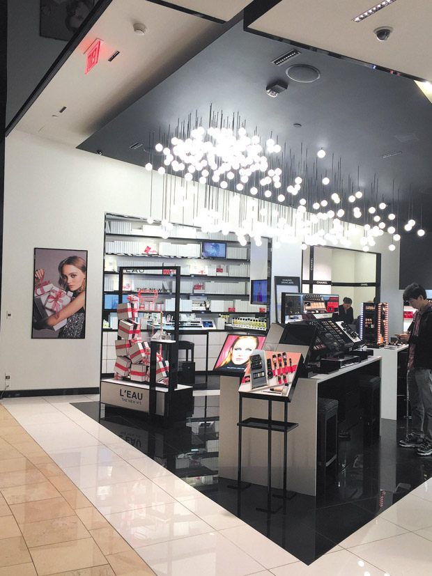
I spent the Christmas holidays with my family in Las Vegas. Strolling by this iconic luxury store one day, I saw a perfect interpretation of my resolution and had to stop and take a picture for you.
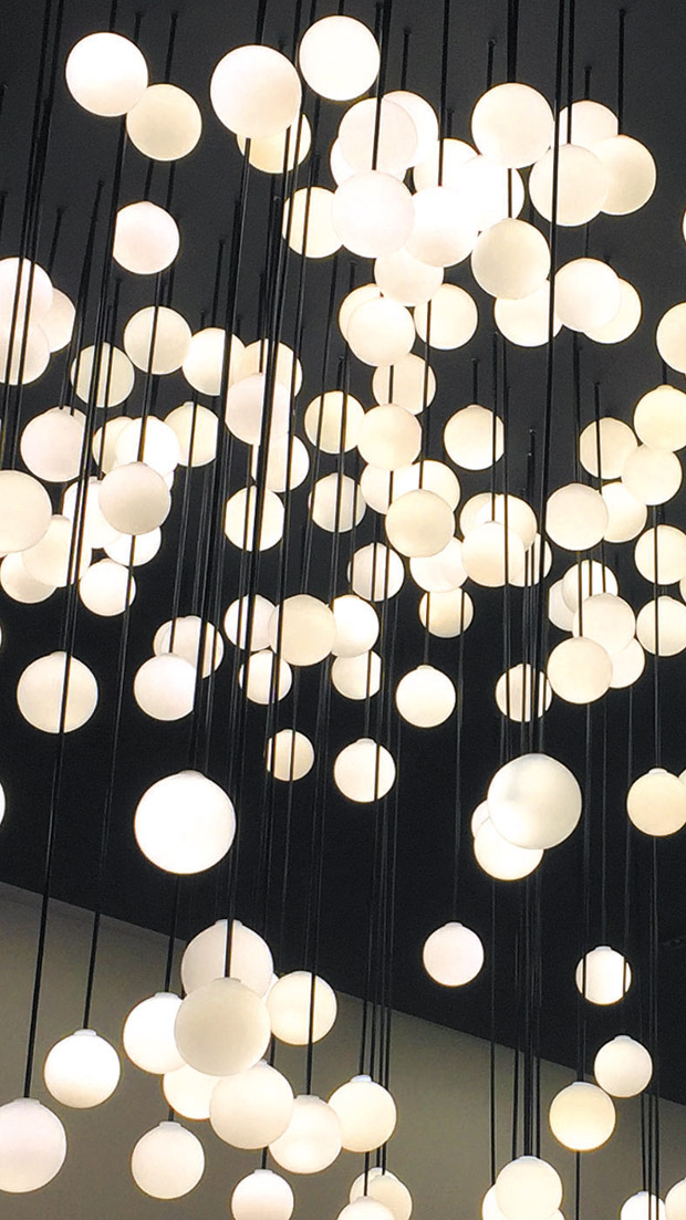
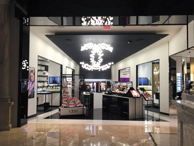
Wherever you are in the store, you see a beautifully random cluster of simple round globes hanging at varying heights. It isn’t until you’re standing directly in front of the entrance that you see that the display isn’t random at all! Those who are paying close attention are rewarded by seeing that those simple globes have been magically arranged into one of the world’s most recognizable symbols. That symbol is a strong draw by itself. But the designer took it a step further and turned the logo into a playful and dazzling statement that beckons you in with its beauty.
I took note and filed it in the back of my mind. Then, delighted at figuring out the design riddle, I went in and bought a tube of lipstick. Now I know I won’t forget my new year resolution — it’ll literally be at the tip of my tongue!
Cathy Lee is a home style expert, speaker, president and designer of Cathy Lee Style. Her redesigns of residential and business spaces have been featured in local and national publications and on HGTV. For more information and inspiring photos of design projects, visit cathyleestyle.com.


