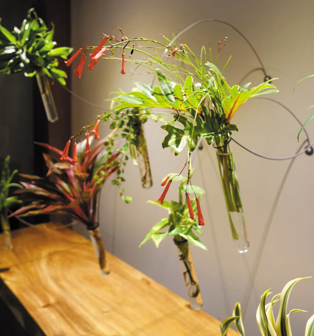
Remember the “living wall” I showed you last time from the Yamamoto Caliboso law firm’s reception area? One of the firm’s areas of expertise is energy and natural resources, so to brand the space for every client and potential client coming through the doors, I created an installation of vibrant tropical plants suspended in cool test tube vases.
My point was that every business — even a law firm — can benefit from branding in its décor. Here are a few more photos to showcase how furniture and accessories helped brand Yamamoto Caliboso’s space and give it a unique identity.

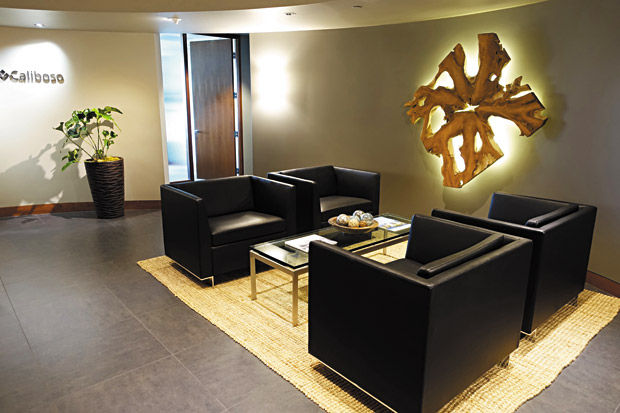
The reception area featured surfaces of slate, glass and chrome. It needed strong organic elements that tied in to the focus on natural resources, and it needed warmth. I found a giant root slab and created a dramatic, eye-catching focal point by backlighting it with LED lights. Grounding the modern seating arrangement is a natural fiber jute rug in a warm wheat-gold hue.
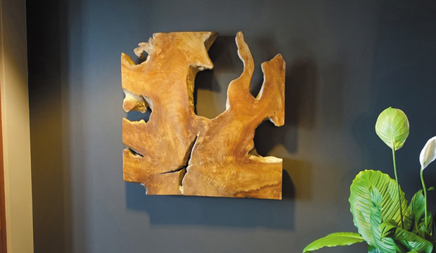
The contrasting combination of cool, sleek finishes, warm woods and greenery is repeated as you round a corner and head toward a conference room. Another beautiful root slab greets you, while varying shades of charcoal on the walls keep you in the modern moment.
It all adds up to a message that’s progressive and green — just like Yamamoto Caliboso. That message is clear, it’s reinforced throughout the space, and
it’s the first impression that greets you when you enter. Shouldn’t all businesses be branded this way?

Cathy Lee is a home style expert, speaker, president and designer of Cathy Lee Style. Her redesigns of residential and business spaces have been featured in local and national publications and on HGTV. For more info and inspiring photos of design projects, visit cathyleestyle.com.
