Empty spaces. Awkward places. Here’s how to take charge of design-challenged rooms and transform them into invaluable parts of your home
Last year, I was asked to decorate a dining room and kitchen for a family of five who had just built their dream home in Manoa. The challenges posed by these side-by-side open spaces are familiar to many homeowners. This week I’ll focus on the dining room and what we did there.
The clients wanted a warm, inviting dining room, but the adjacent kitchen was very cool, with all-white cabinets. That transition would have to be addressed.
Next, the dining room somewhat spilled over to the traffic pathway into the kitchen, so using an area rug as a grounding element would not be a good idea.
Finally, since the kids use the dining table to do homework, we had to provide a comfortable setting that in a pinch could become more formal for entertaining.
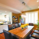
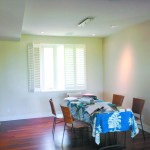
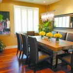
The solutions? We already had a warm palette, thanks to the beautiful hardwood floors. To add to the warmth and bring in a sense of casual elegance, I covered the white walls with a golden wallpaper with a very subtle shimmer. This neutral backdrop embraced the dining room and gave it its own sense of space, especially since we did not want an area rug.
- After
- Before
- After
Next, for a low-maintenance dining table/homework station, we found a reclaimed-wood table whose beauty made it a statement piece in itself. Its chunky mass also grounded the space, further eliminating the need for an area rug.
For seating, we made easy-to-maintain parson-style chairs with a commercial grade, chocolate brown faux leather that could be wiped down for easy cleaning. The material and color added a sense of richness and formality while still being practical.
Our lighting solution was the most fun part of all — a chandelier that became the crowning glory of this dining room. Nothing too froufrou, but the simple chrome bar and cascading crystals added a modern elegance. A mirror on one wall reflected the crystals and made the space feel bigger.
As another functional and beautiful focal point, we added a baker’s rack in the niche. Finally, to give the room some balance, on the empty wall alongside the shutters we hung a piece of art that we made. We surprised our clients by choosing a photo from their favorite family vacation in Yosemite and having it digitally abstracted, blown up onto a canvas and painted in acrylics for an original piece of art.
It served several purposes: It filled the wall space nicely, it’s an image that’s near and dear to their hearts, and it’s a family portrait without being a staid, posed photo. It’s become a talking point at many of their dinner parties.
Phew! That was a lot of tips for one space. I hope you can use some of them as creative solutions for your decorating dilemmas.
Cathy Lee is a home style expert, speaker, president and designer of Cathy Lee Style.


