For every aesthetic eyesore and design dilemma, there’s a stellar style possibility waiting to happen. All you need is some creative thinking
For the last two weeks I’ve shared photos and tips on how we transformed Cake Envy’s cafe and brand identity. As promised, this week I’m wrapping up this series on a more challenging note: solutions to design dilemmas that I hope will inspire you to think outside the box in order to overcome your own design quandaries.
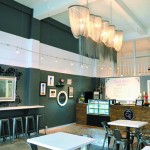
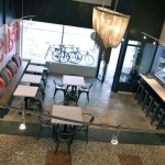
Challenge No. 1: A 924-square-foot space with high ceilings, but little else of visual interest. It needed stimulating decor and functional seating for customers.
Solution: We designed dramatic color-block walls that create the illusion of architectural detail, and draw your eyes inward and up to our focal chandelier. We maximized seating by installing a reclaimed wood bench along one wall, and a built-in counter with a sassy three-dimensional mirror along the other. Both are large, interesting pieces that do double-duty by providing seating, as well as elevating the style factor.
- Photo by Heidi Anderson
- After
- Before
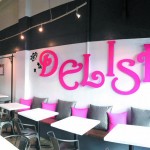
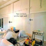
Challenge No. 2: A large, exposed conduit running up the side of the wall above customer seating. The conduit was also in plain view from the street.
Solution: If you can’t get rid of a problem, embrace it and make it part of your solution. The conduit was in such a prime spot, how could anyone not see it? That’s when it hit me: I could really give people something to look at! With Pacific Sign and Graphics, we designed a giant pink DELISH with the L strategically covering our conduit. This art playfully beckons passersby to come in and try the cheesecakes. What was once an eyesore has now become a much-photographed focal point.
Challenge No. 3: Another conduit near the cheesecake counter was no less annoying because it ran from the floor to a point quite high up the wall.
Solution: Once again, a problem can have style potential. We painted over the pipe in black, turning it into a two-dimensional wrought iron sign stand. Painted chains held up the padded, whimsical board above our “stand” for a three-dimensional look. The sign is also functional: It lists the variety of cheesecakes available for special orders.
There are always going to be challenges to designing a functional, well-branded, visually appealing space. Finding solutions is not always easy, but can certainly be rewarding. Whether this is the case with your business, home office or personal space, go in with a positive attitude and look at your challenges as opportunities to do something unique. Taking a picture of your space and dilemma can sometimes help you see it with a new set of eyes. Be fearless … thinking outside the box can be fun!
Cathy Lee is a home style expert, speaker, president and designer of Cathy Lee Style. Her redesigns of residential and business spaces have been featured in local and national publications and on HGTV. reStyle Hawaii, her new-concept furniture and home accents store, is open daily at 420 Keawe St. in Kakaako. For more info and inspiring photos of design projects, visit www.cathyleestyle.com.


