When designing your home or office space, consider going big and bold
Last week’s column may have left you wondering what branding and business materials have to do with designing an environment. Today, I’ll explain how all this adds up to create just the right image.
A few months back, Amy Brookes, owner of Cake Envy, hired me to design her first brick-and-mortar cafe. With a short deadline, this was going to be a challenge.
As I mentioned last week, I took the design job on the condition that I would also be able to reinvent Cake Envy’s image. The photos in that column (you’ll find it at cathyleestyle.com) showed our overhaul of Cake Envy’s business materials. The same concept I brought to these — a look that said bold, fun and of course, delicious — was the one that guided the design of the space.
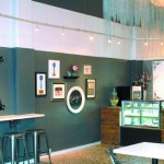
Ever heard that saying, “Go big or go home?” We went big. Big design. Big rock ‘n roll chandelier. Big callout word on the wall. Big mirror. We made a lot of big statements — eclectic statements that all worked with one another as fun pops.
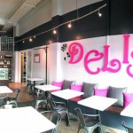
In a small space like Cake Envy’s, you don’t want a lot of little things. Sometimes a few bigger things can make a space feel more expansive. So can mirrors. We positioned this one to reflect another focal point: the word “Delish.” It reinforces one of the themes, so that wherever you’re sitting in the cafe, however subliminally, that word will be on your mind as you’re eating cheesecake.
- After
- After
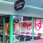
- After
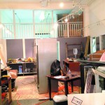
- Before
Now for the color palette. Amy had told me she wanted a pink and white space, but that would have been too cutesy and bubble gum. We went big here too, with broad strokes of dark charcoal and white, and touches of black to heighten the overall feel with drama. I kept the pink as a fun accent, in smaller doses that made the space come alive.
Our color palette and branding extended to the exterior, where the window clings allow you to peek in and see the fun, edgy space and the huge pink “Delish,” which literally calls out to you. People walking by have actually been drawn in by that hot pink invitation, and have come in to check it out!
Finally, wanting to give this dessert shop a sassy look, I mixed in some organic elements. Reclaimed wood adds just the right touch, and we lucked out with the existing pebbled flooring in warm colors with gray accents.
Next week, I’ll wrap up this series with a final topic: design challenges and solutions. I hope these might give you some fun, fresh ideas for your own space, whether it’s a business or a sweet spot in your own home.
Cathy Lee is a home style expert, speaker, president and designer of Cathy Lee Style. Her redesigns of residential and business spaces have been featured in local and national publications and on HGTV. reStyle Hawaii, her new-concept furniture and home accents store, is open daily at 420 Keawe St. in Kakaako. Visit www.cathyleestyle.com.


