Right from the get-go, you can create a favorable image of your home and workspace through the effective use of colors and style, and the correct projection of your brand
Last week I shared with you the most fun part of our remodel project at Y. Hata & Co.: transforming a pair of shipping containers into a bright, relaxing Google-inspired employee lounge. This week I’ll share with you the most challenging of the 14 spaces we tackled.
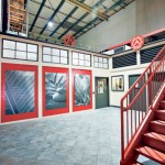
For Y. Hata, a food services company on Sand Island, the warehouse receiving area serves two purposes. It’s the entry for delivery guys heading into the warehouse and refrigerated section, but it also leads to a public restroom and executive offices upstairs. The challenge was upscaling a functional thoroughfare to create a stylish, company-branded first impression for the public and people coming in for meetings.
As you can see from the before-photo, this area was a hot mess — certainly not inviting or reflecting the progressive nature of the company. Since Y. Hata is celebrating 100 years, I felt this would be the perfect environment to pay tribute to its past as well as look to the future. I wanted to create a space with both a retro feel and a modern, progressive edge.
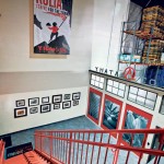
Keeping the Y. Hata color scheme of red, black, gray and white, I created a facade of 12 feet and replaced the chain-link fence with a crimson backdrop to allow the company mission boards, done in an understated but dramatic gray, to pop. The entire metal staircase we painted red to tie in with the crimson wall. On top of the facade is the original Y. Hata logo from 1913.
On the left flanking wall I created a collage by enlarging some of the company’s historical black-and-white photos and framing them in a variety of large scale picture frames. This visual display allows customers, visitors and employees to appreciate Y. Hata’s history.
- After
- After
- Before
As for the future? Directly above is a giant flag representing the company’s motto for the next 100 years.
So if you’re thinking about updating your business space, remember that first impressions do matter. Whether it’s a complete remodel or a light refresh, consider your colors, style and what you are trying to project of your brand. Whether right or wrong, people are judged on how they look. It’s no different with your office, your store or even your cubicle. Design your space not for the identity or position you have now, but for what you strive to be.
Then, find a creative way to make your statement. It was important to Y. Hata executives to display the company’s mission statement and core values for all to see. To add resonance and visual interest to these statements, I had them printed across enlarged black-and-white photos, turning them into pieces of art.
Upstairs, down a hallway leading to offices, I designed a wall with the words “Be the change YOU want to see.” The letter “O” in YOU is a mirror so the message is clear: Don’t look to somebody else to make changes. Look to yourself to start.
I achieved my goals for their spaces: maintain functionality, create a progressive, branded first impression that paid homage to the past and looked to the future, and in looking to the future, inspired employees. Later, I was thrilled to hear that workers have a new sense of pride in their company and their workspace. Go to cathyleestyle.com to see more photos from this renovation project.
This Friday I’ll be giving a breakfast talk at the Pacific Club about simple ways to update offices, reception areas and workspaces to generate better results. If you’re interested in these topics, please go to www.winnerscirclehawaii.com.
Cathy Lee is president and designer of Cathy Lee Style and Cathy’s Marketplace, a furniture and accessories showroom with design services at 1110 University Ave. She recently opened reStyle Hawaii, an affordable, style-conscious consignment warehouse with upholstering and repurposing services at 420 Keawe St. To find out more, go to www.cathyleestyle.com.


