Whether you’re remodeling an entire room or making a few small changes to a space, the right design elements can give any environment its own distinct style
In the last couple of weeks you’ve seen how I’ve transformed some spaces at Y. Hata & Co., a 100-year-old food services company on Sand Island. In this last column of the series, I’ll break down the updates of two kitchens so you can get some tips for yours.
Of Y. Hata’s kitchens, where employees heat up food and have lunch, one was to be a complete renovation and the other a light refresh. Y. Hata calls them the mauka and makai kitchens. My team lovingly referred to them as the Marsha and Jan kitchens.
Do you remember Brady Bunch, the sitcom from the ’70s? Marsha got all the attention, while Jan was always in the background. Here, Marsha was getting the complete makeover, of course, while Jan would keep her original cabinets, refrigerator, appliances and flooring. Not wanting those using the Jan kitchen to feel like they got the raw end of the deal, we had to make sure Jan looked as good as possible while giving each their own distinct personality.
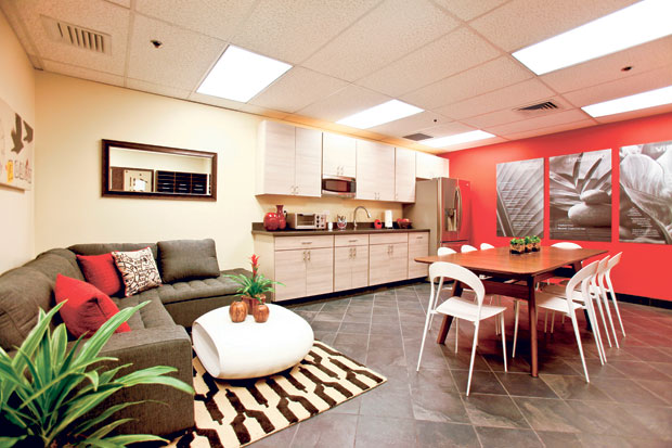
For Marsha, we started by knocking down a wall to open up the kitchen and add space. We also ripped out the flooring and cabinets and replaced them with affordable but stylish and modern cabinetry and a stainless steel refrigerator.
I wanted a clean, modern feel. Sticking with the Y. Hata color scheme of red, white, black and gray, we laid a simple gray-black tile on the floor. For the accent wall we chose a deep crimson which would allow the oversized company statement boards that we designed in grays to pop off. In the center was a simple, contemporary bamboo table surrounded by white chairs.
We weren’t going for just a kitchen, but more of a lounge kitchen with a sort of Starbucks feel — a cool, hip vibe where people can eat lunch and relax. So besides the dining table, we gave them additional seating with a sectional sofa. In a pinch, stools can be pulled up for even more seating.
The Marsha kitchen looks fresh, modern and strong. The keys to this? Sticking with clean lines, from the dining table to the cabinetry and even the angular statement boards, and a bold color scheme with bright, dramatic pops.

The completed “Marsha” kitchen
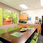
With the Jan kitchen, our challenge was to make it look clean and fresh despite its outdated oak cabinets and black refrigerator. I knew immediately that Y. Hata’s color palette would not work here. This space needed a completely different personality, and red and gray tones would make the cabinets feel older. Instead I selected a color that on its own would instantly scream fresh and modern: apple green.
My starting point was this set of affordable green chairs. I tied in that color with the same company statement boards, which we lit up in apple green instead of gray. This made the room come alive and drew your eye to its vibrant colors instead of to the outdated finishes.
With the Jan kitchen, the goal was to create a bright, modern feel against an older backdrop. The lines of the table and chairs are clean and contemporary here as well, but it was the big, bold use of a striking color that really did the trick. When creating your kitchen, don’t be afraid of color. You can use it as an accent or in big splashes to give your room a whole new personality — just like Jan’s!
Cathy Lee is president and designer of Cathy Lee Style and Cathy’s Marketplace, a furniture and accessories showroom with design services at 1110 University Ave. She recently opened reStyle Hawaii, an affordable, style-conscious consignment warehouse with upholstering and repurposing services at 420 Keawe St. To find out more, go to www.cathyleestyle.com.
Photos: Justin Dotson
