When decorating, color, texture and style are the keys to creating flow between rooms
Last week, I gave you some tips on how to remodel or fluff up your space in 2013 using easy tips of three. This week I’m going to continue with the Discovery Bay unit I remodeled for a client from Canada.
I believe that when designing or decorating a space, you should try to keep it cohesive. Colors, textures, styles. Whatever room you’re in, you should feel that each room is part of the same space. The exceptions are powder rooms and kids’ rooms. (Kids love those princess-pink and dinosaur themes!) So here are some tips on how to keep it cohesive but still interesting.
Cohesiveness is especially important when dealing with a smaller space. Having too many different colors and textures can chop up your rooms and make your overall space seem even smaller. Flow and transition are key.
Remember last week, the flooring material I chose was dark? I used the same flooring throughout the unit, including the bedroom and bathroom, since this luxury vinyl does very well in damp spaces. And because there was no break in the floors, it made the space feel more open.
Use of pattern also enhanced cohesiveness. In the bedroom, I chose a very bold geometric pattern for the headboard, which I placed high enough that I didn’t need art on the wall. I put a coordinating geometric pattern on the pillow and left the rest of the bedding in neutral bronzes and creams.
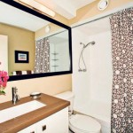
Now, do you notice the geometric pattern in the shower curtain in the nearby bathroom? And in the view from the bedroom to the lanai? There’s also a bold geometric pattern on the wall plaque.
You may not notice at first why the spaces work well together, but because they’re in such close proximity, keeping the repetition in pattern helps create a flow from one space to the next. The added interest comes from the fact that no pattern is used twice.
- After. Photo: Justin Dotson
- Before
- Photo: Justin Dotson
Another way to create cohesiveness is with color. Remember last week, the accent color in the living room and kitchen was orange? Does that mean I need to carry orange through the entire apartment? Absolutely not. But I wanted colors that would carry an island feel and tie in with the orange and my dominant neutral colors.
In the bedroom, I chose a warm green for the accent wall behind the headboard. In the photo it looks bronze, but it’s really a warm sage green that is picked up in the orchid on the bed tray. It’s also picked up in the accent pillows on the lanai furniture. And missing from the photos is wall art that’s also green.
So green tied the bedroom to the lanai, all anchored by a continuation of neutral colors. Did I have to keep going with the green? No! As with the orange, keep some things the same in transitioning from room to room, but change at least one thing. In the bathroom I switched the accent color to purple.
For those who are regular readers, do you remember my tip from last week about elements? Another important element is materials, so glass, wood and ceramics are present in every room.
To keep it cohesive, mentally walk through your space and think what can you incorporate from one room to another to make it flow. But don’t get stuck there — incorporate new elements to keep it interesting. Good luck and go with the flow!
Cathy Lee is president and designer of Cathy Lee Style and Cathy’s Marketplace, a furniture and accessories showroom with design services at 1110 University Ave. She recently opened reStyle Hawaii, an affordable, style-conscious consignment warehouse with upholstering and repurposing services at 420 Keawe St. in Kakaako. Lee’s interior design work has been featured in local and national publications, on HGTV and in her DIY design workshops that teach homeowners the basics of style. Visit www.cathyleestyle.com.


