Here’s how a local business got a stylish makeover to its dreary white-box surroundings, thanks to these sensible out-of-the-box solutions
When real estate broker Kay Mukaigawa of Primary Properties called me, her first words were, “Cathy, I need your help in designing my office — and I don’t want any white walls.”
That was music to my ears!
Kay was opening a large satellite office in the Stadium Mall complex to augment her main office in downtown Honolulu. She faced three major challenges:
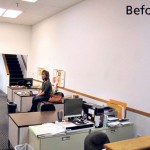
• One, the space where her agents would have their desks was a virtual white box — a 20-by-30-foot area with high ceilings, massive walls and no personality;
• Two, she needed window treatments and signage that would allow her to promote her listings to passersby outside, while still looking good from the inside;
• Three, she needed a redesign of the cluttered reception area to give an immediate first impression of a warm, comfortable and inviting setting.
My job was to take all this into account in creating a space that would reflect the Primary Properties brand in a way that would inspire employees and reinforce clients’ positive perceptions of the business.
In this column, I’m going to address Kay’s first two challenges.
First off, the room. Kay had already bought brand-new desks for her agents, but we were still left with the big white box. As a business owner, I knew that I wanted to help Kay further her brand. Why not make this new office a reflection of that brand?
Branding is not just Apple’s forte. We can take a cue from Steve Jobs and create a workspace and environment to reflect the mission of our company. I wanted to incorporate Kay’s existing colors and style in a progressive, confidence-inspiring way.
- From drab white to lively pale green and dark plum walls — what a difference in colors!
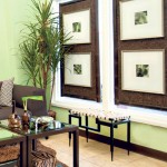
- The author creatively filled these office windows with two double-sided corkboards.
Primary Properties’ logo uses purple, green and bamboo. Love those colors! I selected a very warm, pale green to paint on the interior walls, with two accent walls in a rich, dark plum.
To bring in her brand, I first had bamboo painted on the wall, and then adhered large die-cut letters spelling out the company’s motto. This reinforced a positive message to agents and clients alike while personalizing the space.
On the right wall, I asked local artist Al Ness to paint a three-part oil on canvas that brought in richness and deeper tones. He created a beautiful abstract mountainscape with the purple haze of sunset.
Now, for the second challenge — Kay’s windows, which were a bit complicated. The space had previously been another real estate office, and there was a makeshift stand of wood and carpet where listings were posted for people to see as they walked by outside. Unfortunately, this did not give quite the right impression, and its backside had to be hidden by mini-blinds on the interior.
My remedy? A stylish yet functional “window treatment” that did double-duty. I designed a two-sided corkboard with dark chocolate cork framed in a stained ebony bamboo. Passersby saw listings on a chic, contemporary backdrop, while the reception area got a window treatment and art board. Mission accomplished!
If you’re sprucing up your office, be mindful of outside-the-box solutions. Next week, I’ll share the piece de resistance: a new reception space that greets clients as they walk in — as well as two fundamental principles in decorating any home or office.
Cathy Lee is president and designer of Cathy Lee Style and Cathy’s Marketplace, a furniture and accessories showroom with design services at 1110 University Ave. in Moiliili. Lee’s interior design work has been featured in local and national publications, on HGTV and in her DIY design workshops that teach homeowners the basics of style. To find out more, go to www.cathyleestyle.com.


