By utilizing fundamental design principles such as layering and repetition, this office reception area got a much-needed homey-feel makeover
Last week, I shared with you how we overcame some key challenges in restyling Primary Properties’ new office at Stadium Mall. To counter the large, white and box-like space, we incorporated Primary’s logo colors and added depth and personality with artwork and company messaging.
We also designed a creative solution for “window treatments,” with a double-sided corkboard that showcases art on the inside and listings to passersby outside.
The third and final challenge was to create a reception area that would greet clients and give them a warm, inviting first impression. To do that, I needed to incorporate two bedrock principles of decorating: layering and repetition.
What I’m talking about is style, color and texture, and how you combine them. Most people understand style and color, but texture can be trickier to grasp. It’s anything your eyes or hands can rest on — from wood flooring, a brushed-nickel door handle or a ceramic candlestick, to a gorgeously patterned pillow or even subtly shimmering wallpaper. Texture can be material or visual.
It’s how you mix textures that will make your room come alive. Layering different textures creates contrast and personality. Repeating them around the room will make it feel cohesive and put-together.
Let’s take a look at how layering and repetition helped give Primary’s reception area a warm, eclectic, contemporary island feel.
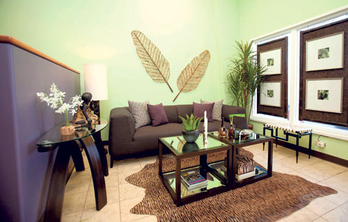
My anchor piece and first purchase was a clean-lined, chocolate-brown sofa. That gave the space a modern feel, but to create an eclectic vibe, I needed to layer in another style and texture.
In came my animal-skin rug. Talk about edginess and pop! On top of that I layered two wood-and-mirror side tables that, put together, became a coffee table.
How many textures have I layered already? Now, to keep the space from getting chaotic, I needed to start repeating them. The console table I found picked up the same dark wood of the coffee table, and its clean lines and glass top enhanced the modern feel of the style-setting sofa.
On the wall I layered in a new texture: a woven banana leaf wall hanging. That also introduced a touch of island flavor, which I repeated in the bamboo frame of the window treatment.
I repeated the glass in the console table with my amber vases on the coffee table, as well as the amber glass vase in the floor lamp.
Colors also need to be repeated. Notice the cream in the lampshade is picked up in the accent pillow, the creamy leather of the bench and the matting of the pictures on the corkboard. The color purple is repeated from the pony wall into the accent pillows on the sofa.
To add even more interest, I introduced metallics. The silver in the candlesticks repeats in the lining of the artwork as well as the handle on the dish for business cards on the coffee table.
As you can see, many elements have been layered and repeated. There are lots of different textures ranging from wood and metal to glass and upholstery. But repeating styles, colors and textures made this room feel not only eclectic and interesting, but pulled-together as well.
This is something anyone can do on any budget. Assess your space. Determine what direction you want to go in with style and color. Once you’ve chosen your style (or styles) and color palette, see what you need to add more of or edit out to achieve these. And in all your choices, keep in mind your goals of layering and repeating textures.
On a fun side note, here are some behind-the-scenes tricks I used:
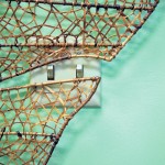
Almost centered on the wall behind the sofa, very visibly, was a light switch. I was able to disguise it by finding organic-shaped wall art that went around the switch.
Prominent in one corner was a fire extinguisher. It’s still accessible and ready to put out any potential blaze, but its visual impact is hidden now by the artificial plant.
Mission accomplished: a restyled office that reflects its mission to sell homes in a professional environment that’s as close as possible to a warm, inviting home!
Cathy Lee is president and designer of Cathy Lee Style and Cathy’s Marketplace, a furniture and accessories showroom with design services at 1110 University Ave. in Moiliili. Lee’s interior design work has been featured in local and national publications, on HGTV and in her DIY design workshops. Visit www.cathyleestyle.com.
Photos: Cathy Lee


