How many designers does it take to screw in a light bulb? Only one — but it will be the most fabulous light bulb you’ve ever seen.
As any designer will tell you, lighting is crucial to good design. This is particularly true when lighting a bathroom. It’s the one room in a home that’s often overlooked, but improper bathroom lighting can make the bravest among us refuse to look in the mirror.
My clients, Tertia and Jason, know all about that. The couple and their two sons live in a house built in 1987, and while most of the home was updated, their master bathroom remained oblivious to the passage of time. With floor-to-ceiling black wall tiles, a cramped shower and no storage, the ’80s bathroom was really showing its age.
And don’t get me started on the lighting. The room had one bleak overhead fixture that made showering a nightmare, while the vanity lighting was so unflattering it’s a wonder Tertia managed to put on lipstick in the morning.
They wanted a bathroom that was functional — and had a warm, contemporary vibe. So, putting the principle of bathroom-lighting design into play, I got set to create a modern, spalike retreat for Tertia and Jason.
I started by gutting the entire space — walls came down, counters came out, tiles were scrapped. Then I painted the ceiling white, bathed the walls in soft beige and installed charcoal porcelain floor tiles with a non-slip surface.
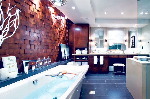
From there, I laid out the fixtures and finishes. I created a gorgeous vanity by the room’s window, which was a good source of natural light. I put a soft chiffon blind on the window and flanked it with two mirrors. I then installed a counter constructed out of butter-scotch polished quartz, a perfect foundation for “his and hers” cast glass sinks. These deep sinks sit on top of, and beside, new dark wood cabinetry that provides a ton of storage.
Adjacent to the vanity, I created a spectacular feature wall comprised of small wooden square tiles of different depths. Against this wall, I selected a beautiful free-standing tub and a modern toilet.
On the wall facing the tub I designed a large shower out of tempered glass, more quartz, a stunning mosaic-tiled backsplash and small porcelain tiles that match the floor.
Modern bathrooms can often feel cold and sterile, but the wood wall, dark cabinetry and warm quartz in Tertia and Jason’s bathroom work to offset the cooler fixtures and finishes.
The best part of this project was shopping for, and installing, some amazing lights. I installed recessed lights in the ceiling and worked in spotlights above the feature wall to accentuate the wood tiles. I chose waterproof, in-floor lighting to highlight the sculpted tub and lights for underneath the sinks. I also selected incandescent silver sconces for the vanity — soft lighting that is good for when she applies makeup.
But the real showstopper is the fixture above the tub — a laser-cut steel globe that allows light to be cast all around the room.
This bathroom is a perfect example of how good design that includes layers of light can transform a space. By using techniques such as spotlighting a feature wall and uplighting a tub, I gave Tertia and Jason a bathroom that is ideal for their morning routine — or their evening reprieve.
As I always say: “If you light everything, you light nothing.”
Candice Olson is host of HGTV’s “Candice Tells All.”
