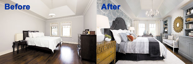
How do you turn a boring master bedroom into a bold expression of timeless, yet traditional, design? As I tackle my latest project, you’ll see that the solution depends on the plan — and the plan, in this case, hinges on a pattern.
A stroll through Colette and Edward’s lovely two-story house reveals a tasteful yet neutral color palette, with not a pattern in sight. Although it has great bones, the master bedroom is a distinctly uninspiring space. Bare walls, a shortage of storage space and Edward’s former bachelor-pad furniture are certainly sleep-inducing, but hardly conducive to a romantic retreat.
It’s definitely time for a change, and both Colette and Edward are ready to let me take them into uncharted territory by making a big, daring statement with their master bedroom.
People are comfortable with traditional, familiar shapes, but the familiar crosses into the realm of classic contemporary when you mix in a dash of the unexpected. And that’s the key to easing people into patterns: choosing a print that interprets familiar shapes in fun new ways.
With this in mind, I opted to make the wall behind the bed a focal point using handmade wallpaper that features a bold lotus-flower design.
The next step was to upgrade Colette and Edward to a deluxe king-size bed, with room enough for them and their young daughter. A custom-made, oversized head-board upholstered in a solid charcoal fabric helped balance the print on the wall.
This bedroom’s classic vaulted ceiling is one of the most impactful elements in the room, but it got lost in the bland pre-renovation landscape. To give this ceiling the attention it deserves, we treated it with a teal-tinted metallic glaze and then dragged a brush through it while still wet, to create tiny striations that produce an elegant effect.
To add more valuable storage space, I designed two custom cabinets for the wall opposite the bed and then created a comfy nook for reading and relaxing by placing a classic settee between the cabinets. The settee’s frame was lacquered in an off-white and I had it upholstered in a gorgeous complementary patterned fabric.
Now it was time for all the finishing touches that give a room personality. The custom drapery panels are made from solid blocks of fabric that pick up the room’s predominant hues of cream and charcoal gray, with a cranberry stripe to add a bit of punch. I chose a wonderful ivory area rug with a subtle inlaid pattern, and matching carved wooden night tables topped by a pair of white vase-shaped lamps. Wonderful accent pieces were chosen in shades of silver, plum, jade and walnut, and some of these were placed on the modern desk positioned in front of the windows. Once again, we picked up our color palette in the bedding.
Charcoal and cream are complemented by accent pillows that pick up on the draperies’ cranberry stripe.
For the final touch, we installed the perfect lighting fixture to crown the room: a beautiful, blown-glass, eight-light chandelier. It’s definitely the piece de resistance in this makeover.
When Colette and Edward saw their new bedroom, it was love at first sight. The classic yet contemporary patterns we used made the bold statement Colette wanted, while the space reflected their dynamic personalities. Now, there is more than enough room for them and little Clara on those lazy Saturday mornings.
This bedroom has gone from bland to bold, and, with a little help from some gorgeous patterns, has become the private sanctuary this couple was craving.
Interior decorator Candice Olson is host of HGTV’s “Candice Tells All.”
