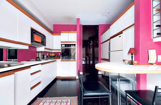
For some, the ideal kitchen is a big, noisy place where soup bubbles on the stove and everyone assembles around a big table. But for others, the perfect kitchen is one that is completely hidden away: no unsightly stovetop grill, no coffee machine on the counter, no imposing stainless steel fridge.
Creating hidden kitchens is a challenge, but it is one I recently accepted while working with my clients, Doug and Keith. The couple lives in a beautiful, historical house that they renovated in an uber-modern fashion. But, somehow their renovation hammer missed their small, pink, ‘80s-style kitchen that stood out like a sore thumb in an otherwise streamlined home.
Doug and Keith wanted a seamless path from their front door right through to their outdoor patio, and that meant a kitchen that didn’t obstruct the flow. Don’t get me wrong, they still wanted a fridge and a stove and a dishwasher — they just didn’t want to see them.
For a tiny space, it would be a massive renovation. But I knew that by applying the principle of hidden design, I could serve up a delicious, contemporary kitchen that was simply out of sight!
To start, I had the whole space gutted, the electricity reorganized and the plumbing rerouted. I also put down a stunning dark hardwood floor and painted the walls in bright white. Then, since a big part of this project was to connect this tiny kitchen with the patio, I blew out the back wall and installed two huge sliding glass doors surrounded by beautiful zebra-wood. This creates the illusion of not having a wall between the two spaces.
Next, I concentrated on the kitchen’s two main walls. The first wall was all about function; here, I stacked an oven and microwave on one side and hid a stainless steel fridge, freezer and wine cooler behind custom white panels on the other side. In the middle is a white crystalline sink with a glass cutting board that slides across when it’s not in use. Below the sink I put some hidden storage, as well as a pullout trash and recycling bin.
I chose bright white quartz countertops and a back-painted glass backsplash (and the half wall/pantry adjacent to it). This ups the glamour factor and helps reflect the light in the kitchen, rendering the small space visually larger.
Across from this functional wall, I created a wall that is all about beauty. I constructed an archway of wood, housing recessed lights, around horizontal panels of more back-painted glass. This stunning wall is highly reflective and adds a huge amount of depth to the little space.
In the middle of the kitchen, I installed a magnificent kitchen island with a solid glass countertop. This island can be used as an extra prep surface, a casual dining table or — with the help of the integrated LEDs — a funky, illuminated cocktail bar. Hidden in this island are storage and a dishwasher, in addition to an induction cooktop that sits flush with the countertop. Even the cook-top’s ventilation stays out of sight until needed.
By the time I was finished, this kitchen had everything: tons of storage, state-ofthe-art appliances and plenty of modern conveniences. Everything was just hidden away behind cupboards, doors and drawers. Concealed, clean and pared down.
What was once a time warp from another decade is now a gem of modern function and beauty that flows perfectly with the rest of the house. Out of sight, in more ways than one!
Interior decorator Candice Olson is host of HGTV’s “Divine Design.”
