Keeping up with your neutral colors
 I always have been a fan of an accent color. In my wardrobe, I have belts, sweaters and scarves in bold hues that I use to punch up otherwise muted outfits. In the home, I painted a bookshelf a bright, beachy blue, and added throw blankets, pillows and other accessories in uplifting colors.
However, whenever I think about adding a bold color, I remember a piece of advice a designer gave me years ago: Go bold, but don’t go bold all over. Her advice had a great underlying message. If you want something to pop, give it something to pop against.
Perhaps that’s why, in the home, many of us opt for neutral colors. But what is neutral? The main question to ask when making this decision is: Will this color compete with my bolder pieces? If the answer is no, then that is a good start. This year’s color of the year, according to Benjamin Moore, is “Simply White.” But if you are like me, you might like a shade with a little more personality. Enter neutrals. These colors nicely pair with just about anything, and, believe it or not, they come in many shades aside from beige and white. If you are painting or outfitting your home, consider some of these new neutrals:
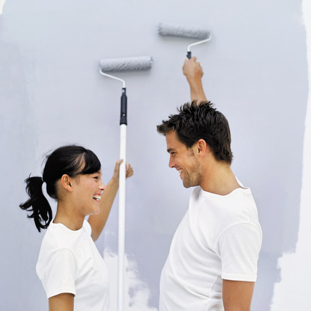
Grays: Shades of gray don’t have to be drab or depressing. In fact, they can offer a nice backdrop for nearly any other color, such as jewel tones, blues, and even non-colors like black and white. Darker grays make lighter accessories pop. For instance, consider placing a light driftwood piece against a dark gray wall. Lighter shades of gray can emit a cooler feel. Paired with that same piece of driftwood, a lighter gray gives off a calmer, soothing sense. Punch it up with bolder accessories or touches of green foliage, if you wish.
Blues: These might be my favorite new neutrals. I particularly like the beachy feel a very pale blue emits. Living in Hawaii, we can take our cues from our natural environments. Look at what works well with the colors of the sky and ocean. These materials and colors also will pair well with shades of blue.
Greens: Mixing blues and yellows, these shades can give off a calming, earthy feel. In fact, in 2015 the Benjamin Moore team named their Guilford Green the color of the year. It was easy to see why. The shade has tones of brown and gray, which make it great for pairing with other colors, also while managing to stand out on its own.
Have a question or comment for Joanne? Email her at thefixisinhawaii@gmail.com.